Popups are among the best ways to encourage visitors to subscribe to your newsletter. Surveys act as feedback loop management systems and potential lead generators, since customers also want to leave feedback or reviews after interacting with the business. On the other hand, popups encourage visitors to take action by creating urgency or showcasing amazing buying opportunities.
Pop-up subscription or lead forms then ask visitors to provide contact information such as email address, phone number, etc. When used correctly, email popups work for almost every segment of consumers, from new visitors to regular customers.
Table of Contents
Why is it Important to Collect Email Addresses?
Email campaigns increase their initial interest and connect people with your brand. The most effective way to get contacts from your website visitors is to offer added value. In the “Exchange” section for an email address, you can, for example, offer:
-
- Important news and information
- Discounts or coupon codes
- E-books or guides
- Online seminars or courses
Of course, you should keep your promises because your prospects will expect the content to come to their inbox after they leave their information to you. When you have customer contacts, you can keep in touch and build strong relationships with your target group. In such a way you will increase brand awareness and, most importantly, convert site visitors into actual customers.
How to Correctly Use the Email Pop-Up Window
Many sites and applications use popups to prompt users for an email address before they read the content. The biggest offenders in this category were news sites and apps, online stores, and blogs. People dislike the pop-up window and the fact that the website requests an email address too soon, which is why this strategy is tricky. In addition, they assume that the site will send them spam.
When requesting an email address from users, you should consider the side effects. Sites and apps often display popups prematurely due to the short-term growth of the metrics they provide.
Instead of showing email request popups at the very beginning, think about when it’s more convenient for users to leave their email. For example, they are viewing a category for which you have a promo code for them. Or maybe they just read (or skimmed through) an entire blog post. These actions can be suitable triggers for an unobtrusive, modeless overlay to appear. Place it in the top right or bottom right corner and make sure it takes up a reasonable amount of screen space. Offer users something of value and tangibility in exchange for their email address. Don’t expect them to give it to you so easily.
Best Practices for Collecting Email Addresses
Adding a subscription offer to your site’s homepage is one of the most effective ways to collect emails to send out emails. As we said, to make your newsletter the most attractive to your visitors, you must offer them something valuable. For example, a discount on your first purchase, access to exclusive offers, unique articles, tips, guides, and other useful materials.
Here are some tips to help you create an effective subscription offer on your site’s home page:
-
- Use bright colors to grab attention.
- Make the pop-up text concise and compelling.
- Make sure the subscribe button stands out from the rest of the content.
- Limit the amount of time a visitor has to decide whether to subscribe.
- Use triggers to determine when to show the form. These can be specific user actions, such as scrolling to a specific location on a page, hovering over a link, or dwelling on a page for a specific period of time.
- Be sure to indicate on the privacy policy page what data you collect.
Homepage popups are a quick and easy way to collect emails for your email campaign. Make your offer attractive and stand out on the page with color and layout to get the most out of this method.
Three Effective Examples of Popups for Collecting Email Addresses
Every visitor who meets the requirements sees a pop-up window when it appears on a specific page. Other marketing channels, such as social networks, email, search engines, or the registration form on the side of the screen, cannot boast of such reach.
If your blog page or landing page has sign-up forms that boast a high conversion rate, pop-up windows will increase this rate by reaching a wider audience. This section will describe three effective examples of using popups to collect email addresses.
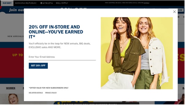
Old Navy is a brand dealing with attire and accessory items for both men and women. In this case, a welcome popup gives a 20% discount. Even if the user is not going to make a purchase yet, they will still sign up to get a discount in the future. In addition to the discount, Old Navy promises other benefits for the subscriber: information about new arrivals of goods, promotions, and promotional codes, exclusive sales, etc.
2. Jeff Bullas
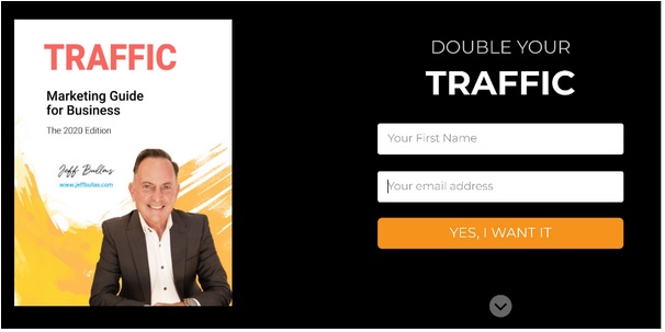
Here we see a welcome pop-up window that asks users to provide their contact information:
Jeff Bullas is a marketer and the author of a popular marketing blog. Instead of promising mountains of gold, the author focused on one promise: increasing traffic. Given the specificity of the topic, it will be easy to add subscribers to your drip email campaign.
3. Loaded Landscapes
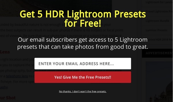
After scrolling the page, a pop-up window appears, and photographers will respond with great pleasure:
Loaded Landscapes is a site about landscape photography. Considering this factor, the popup is relevant to the audience. The text of the pop-up window contains information about the number of free presets for subscribers. The call-to-action button is bright, and the text clearly describes the benefit for subscribers.
Conclusion
All services and ways of using email popups are different. There is no one ideal solution for all companies. That’s why testing different platforms and ways of collecting customer data is important to find what works best. Once you have built a good customer base and are attracting potential customers, you can improve your contact with them through email campaigns to achieve the goals you define for yourself.


